DIY kit
Base and hardener, together with application accessories. A practical starting point for your own project.

Earth tones. A distinct texture.
A material-led range introduced with charcoal and red clay. Dark neutrals, warm tones and silver finishes offer a different relationship with the tile.
Ask about Well-being Compare the collection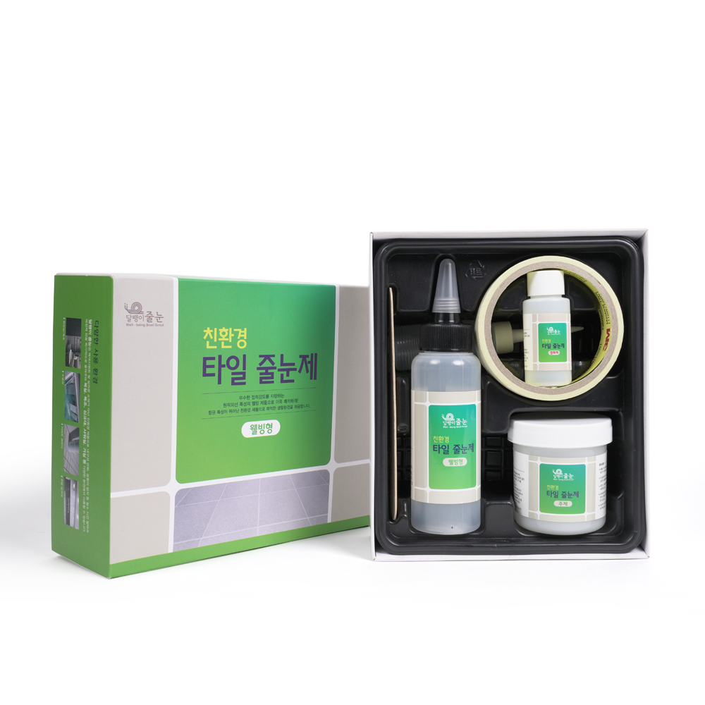
The Well-being range is introduced with charcoal and red clay. Its company colour references include black, wine, pumpkin, light silver, red clay pearl and dark silver, bringing warm and dark alternatives to the collection.
Consider how a darker joint changes the reading of a pale tile layout. Warmer wine, pumpkin and red clay tones can be compared with stone-effect and earth-coloured tiles. The choice remains a visual and application decision that benefits from a physical sample.
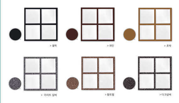
The company's tile-and-joint samples show the colour around a light tile. A photograph offers another point of reference alongside the illustrative colour library.
Screen display and lighting can change the appearance. Request the actual sample for your chosen colour before making a final project decision.
Specify the exact colour name in your inquiry. Ingredient descriptions and the range name do not establish a health benefit. Ask for the applicable product information and any supporting documents relevant to your intended use.
| Colour | The Well-being colour name, with the tile colour or photographs of your surface. |
|---|---|
| Orientation | Floor, wall or edge. The catalogue distinguishes formulations for their working characteristics. |
| Project size | Tiled area, tile dimensions, and joint width and depth when available. |
| Supply format | DIY kits with application accessories, or professional packs for installers with their own tools. |
| Site and market | Country, intended application and exposure conditions, plus any project document requirements. |
Colour references from the company collection.
Screen colours are indicative; ask for a physical sample.
Black
Wine
Pumpkin
Light silver
Red clay pearl
Dark silver
Pair warm mineral tones with natural-looking tile, or use a dark joint to make a light tile pattern more pronounced.
Base and hardener, together with application accessories. A practical starting point for your own project.
Base and hardener for installers with their own application tools. Discuss the pack format and quantity for your project.
Application orientation matters. The company catalogue distinguishes floor and wall/edge formulations for their working characteristics.
Keep exploring
Normal Premium EcoTell us about your tiles, your space and your market. We’ll take it from there.
Talk to ATM Korea